Kerrang is published by Bauer Media group.
Bauer Media group on their website describe their Kerrang audience as 'Young, individually minded and passionate consumers, an audience defined by attitude, passion and loyalty.' and '15-35 males bias'. The magazine is £2.20 to purchase of the shelfs and is published on a weekly basis. The total circulation of the Kerrang per issue from the 1st of January to the 30th of june 2011 is 43,033
 |
| This is the data given on the NRS website |
 |
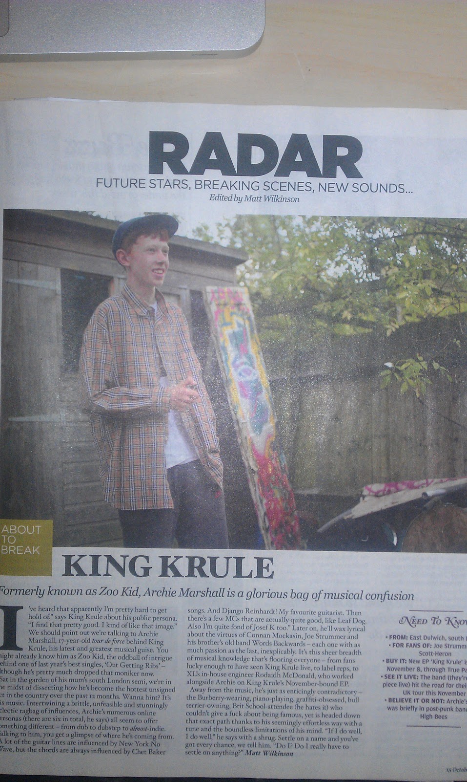
| Kerrang 0ct 15th |
The cover:
The title of the magazine is Kerrang, its a sort of onamatapheic sounding word relating to the strum of an electric guitar and also highly relavent to the type of music that is inside the magazine.


Kerrang also seem to alternate between black and white for their Masthead, they also seem to put the Masthead behind their main cover protaganist but always making the first two to three letters of KERRANG visible so the magazine is still very recognisable.
The strapline of this issue is 'Slipknot' written in the style that artist promotes it in, its also written over the protaganist who is feature in red overalls, so the background behind the 'slipknot' text is red.
 The main image of the cover is a member of the band Slipknot dressed in a bright red boiler suit and clown mask as all members of the slipknot all wear different masks and a rarely seen not wearing them. The member is standing straight up right (Full body shot) with his feet together, staring straight into the camera also the expression on his mask adds to the menacing and creepy look given off by the photo also we can see that separate lighting has been used, one softbox over the subjects left shoulder and one other up high infront of his right shoulder showing up all the dark creases in his clothes adding a more sinister and grim look to the photo.
Other images that appear on the magazine cover are of other artists featured in the magazine with one other image of the iconic album artwork related to the slipknot cover, some other images that appear on the front cover of the magazine are pictures of the posters that can be found inside the magazine.
The cover lines on the cover of kerrang promote; the artists that are featured inside the issue, posters that a inside the issue and other things like '1000 gigs listed !'.

 Colours used in the typefaces and graphics seem to coincide with the main image on the cover, lots of writing is seen in red or with a red background behind it the colour also looks like its been sampled from the main image and also all typfaces used seem to be of the same font unless a headline ect.Tthe language used is quite simply short and to the point to lure the reader into the magazine; 'You me at six, inside the film premiere of rock's hottest band'. The cover differs majorly form other magazines i have looked at, for example the masthead is behind the front image whereas on other magazines - NME for example the masthead is infront of everything else and made almost the center of attention to the viewer, although NME has a different type of genre based in the magazine, we can see that both magazines have there own style to accompany their genre as NME has a vintage look and feel about the cover image and Kerrang has the grunge, rock look to it.
Inside:
There are in total 63 pages in the magazine and 20 of them are of adverts, adverts featured in the magazine are; albums, Kerrang advertisments, festivals, video games, DVD's, tour dates, drinks and a few other obscure adverts. From this we can see what the target audience of the magazine would be from the video games which would be teenagers and up and also from the type of festivals and the types of albums advertised.
There are a total of 14 double page spreads in the magazine, 3 of those double pages are with slipknot who are featured on the cover, other double pages are of; reviews, other bands and artists and other gig guides ect. These double pages show what is the most intresting in the article and help to lure in readers and viewers.