Thursday, 29 March 2012

Evaluation Question 5

How did you attract/address your audience?


The Audience that i particularly wanted to attract was the indie scene, this genre of music is very popular at the moment and it seemed most beneficial if that genre was the genre of my magazine.


In the Radio 1 chart currently, at number 3 is the song Somebody That I Used to Know by Gotye, this song comes under the indie genre and it shows that indie music is quite popular not just for the indie scenester but for everyone that likes music in general. The song is typically instrumental with a guitar and some other simple instruments being played, in the video we see a man who could be of the indie genre judging by his hairstyle.
This information shows that the genre i chose for my magazine is a popular one and that people that like the music and follow the genre will be interested in buying the magazine.


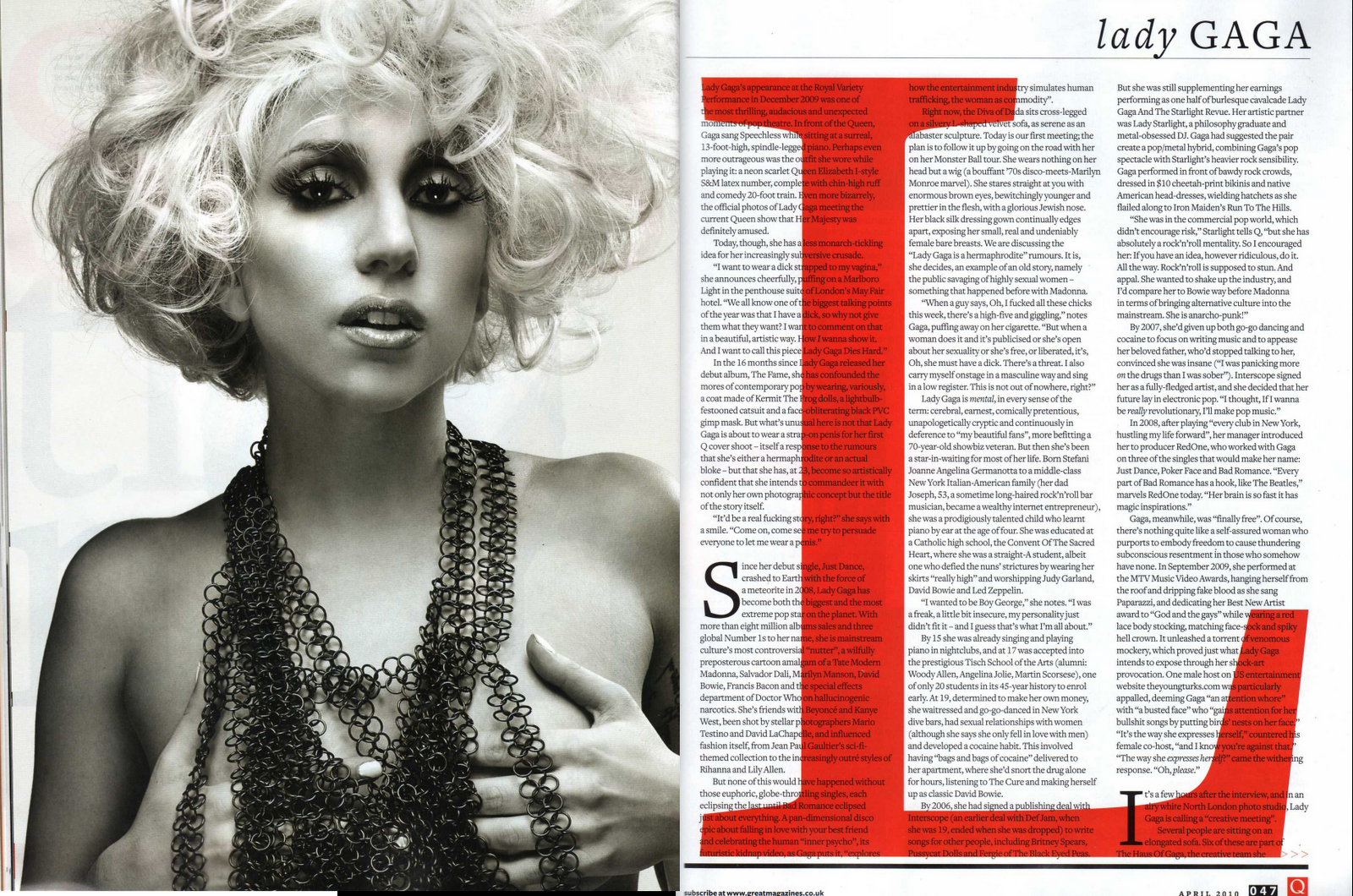
When looking at NME magazine and relating it back to my music magazine, there is a clear link between the two, 
colour co-ordination is the same using a simple set of 3 colours on the front cover, the layout is also similar in the way the title and text is laid out on the page.
Although the clothing cannot be seen in this example of NME magazine, the style and genre is the same, i tried to match the fashion to that of the indie genre.

NME is the most similar magazine to my own as it is dedicated to the indie genre, The easiest way to target your audience and to find a unique selling point when working with the indie genre is the clothing that particular magazines use, as indie's dress very 'uniquely' their very identifiable to the everyone, this means that it going to be easy to catch they eye of the desired target audience, i chose simple clothing in my magazine photos but clothing that represents indie's, the hairstyle is also key to the audience, I chose hairstyles that would easily portray the indie genre and help identify the unique selling point of the magazine.

Thursday, 22 March 2012

Evaluation Question 6

What have you learnt about technologies from the process of constructing this product?


Camera: Canon 400d rebel XTi
Im already very familiar with cameras, so the camera side of the task wasnt that difficult at all, i used different f-stops, faster and slower shutter speeds and different film speeds when taking my shots for the task. The canon 400d is a mid ranged dslr although a bit dated now with evermore broad technology, its a 10 megapixel camera body with full manual control of the shutter speeds, film speeds and aperture sizes all of which are very useful when wanting to create different types of photos. For my photos i mainly used the lowest f-stop as i like the effect it gives photos along with that i would use iso100 when taking pictures during the day and iso400 at night, nothing higher as i don't like the way it washes out the images and finally i would use shutter speeds no higher than 1/200 as i use the off camera flash alot, the shutter speed needs to be able to catch the light.

This is the location of some of my photos


Lens': 18mm - 55mm, 8mm
I used the 18 - 55mm lens mainly when taking my photos for the task, but also used my 8mm for some of the photos to get a different aspect on the photo. The 18-55mm was used for the majority of the photos because it has a good focal range with some wide angle at 18mm, it also give a lot more flexibility because of the zoom. I used mainly the lowest aperture on this lens as i prefer to give my photos a blurred depth to the picture. The 8mm fisheye was just for some fun really and to see if got any good outcomes from the photos, the fixed focal length means that i had to be a prescribed distance from the subject which proves an inconvenience, although the warped photo effect is very fascinating and quite attractive.

Flash: 430EX II, wireless triggers
I used this flash with my camera to really light up the photo, seeing as i only have one off camera flash i could only use it as a fill light, but this enabled me to make harsh dark shadows from an angel behind the models. When using this flash i had to make sure that the shutter speed was bellow 1/200 as the camera wouldn't have been able to have caught the flash. This flash is also has a fully adjustable strength allowing me to change and control how bright the photo would be and if i wanted to allow the sunlight/natural light to still be shown up in the photo.


Macbook Pro, iMac
At home i have my own Macbook Pro to use with all the software that i need on it, in school iMac's are also available for me to use with the software that was needed for the task in hand. With the ability to photoshop at home it made it more flexible for me to do the photoshop/editing side of the task.

Photoshop CS4, InDesign CS4, iPhoto
I was already quite familiar with the software, although i had only used InDesgin once before, i managed to get to grips with it fairly quickly.

Voki, Animoto, GoAnimate
Voki is a animated character that you can make talk, although the online narrator was not very good, i still chose to put my animation in my blog for one of my evaluation questions. The other online software i used was animoto, animoto allows you to upload photos and videos and then it will put it all together into a slideshow with cool transitions along with music of your choice. I used animoto on my last evaluation question. GoAnimate is a useful online app that allows you to create your own character and animate him/her in a wide variety of scenes, you can choose what they say and what kind of accent they have along with actions they make, its a fun useful way to presentate information.

Sunday, 18 March 2012

Evaluation Question 7

Looking back at your preliminary task (the school magazine task), what do you feel you have learnt in the progression from it to full product?


I managed both tasks reasonably well, having photoshop at school as well as having it at home proved very useful as i was able to get work done out of school hours letting me do more work during school hours. When it came down to equipment i was readily equipped with a very good DSLR and other photography equipment as i already had an interest in it.

During the creation i came across a very distinct problem, in one of the photos that was perfect for my front cover one of the models wasn't looking directly into the camera lens, i could either use photoshop to touch it up or take his head from another photo that was suitable enough and put it onto the other photo.
As you can see here, on the left is the final photo after it had been edited and on the right is the original photo where you can see that the model on the far left isn't looking straight into the camera.
All i did was simply take his head from another photo, crop it with the lasso tool and drag it onto the other photo, i then used the clone stamp tool to adjust the area around his head in the background so that it looks like the photo was taken legitimately like that.

When managing  my models i sent all three of them some photos of what i was looking for and then gave them a description of; suspenders, plain t-shirts, trousers not jeans etc. scruffy but smart. I chose not to put any props like guitars or drum kits etc. in the photo because to me its seems rather cliche and typical to represent a music magazine, i wanted to portray the band as they are without any props making the end magazine more authentic. The location i chose for my photographs was a disused barn with rusted and bare metal showing and long grass to give the photo a boost to make it look and feel vintage, it also also adds some dark contrasting colours letting the photo look more glum and moody.


Sunday, 11 March 2012

Double page spread construction

Firstly i chose an a3 sized page, made is landscape and also added 6 columns to help with the layout of my page.


After i dragged in the image that i was going to use into the indesign document, when scaling up the image to fit the size with out warping the dimension of the photo, i held command and shift at the same time and then enlarging it, after i cropped down the photo by using the arrows you would normally use to scale the photo.


Here is where the text box tool is located on the toolbar at the side.
Here is the first text box i drew for the title in the top right hand corner, i used the same font style to keep the house style the same and strong, i then kept choosing larger sized fonts until i reached a good size which was around 100.
After i chose the font to be white and then i right clicked the text box to bring up some options, i then went down to effects and selected transparency.
From there i chose a 75% transparency giving a cool effect on the title.
After i started adding the bulk of the text, firstly i drew one text box then copy and pasted my text in, in the corner of the text box is a small plus symbol, this allows you to create another text box with the rest of the text in and so on.
After i highlighted all the text and made it size 9, this seemed appropriate as i had a lot of text and large photo as well.
Here is showing how i resized the text boxes so they fitted nicely on the page.
I then moved and resized the two other text boxes in the bottom left hand corner of the page, as they both had white text in i thought it seemed appropriate to put a background behind them which enabled them to be read easier.

Here the box tool is highlighted, this is the tool used to create backgrounds behind the text, simply just draw a box like the text box tool and choose which colour is desired.
I made the whole box black to start with and then moved it back behind the text.

after i went into the effects and changed the transparency to 50%, which enable to reader to still be able to see the image behind and allowing them to still be able to read the text.
Here is the finished product.

Sunday, 4 March 2012

Evaluation Question 4

Who would be the audience for your media product?


This type of person comes under the very typical Indie genre of today, Indie followers aspire to be marginally different form the next Indie follower, wearing cardigans, suspenders, Harington style jacket and stripy chequred shirts from the second hand charity shops and maybe even urban outfitters if there lucky, Indie's will also typically go to places such as brick lane to shop in rough trade or to just spend some time. They choose to listen to music that isn't quite mainstream and well known but they also like to listen to bands like Joy Division and The Beatles although the list of bands they like is ever changing. TV on the Radio, The Vivian Girls, Vampire Weekend, Spank Rock and Shit Disco are some of the sounds they like, as is hip French label Ed Banger Records, the home of Justice.  Indie followers won't choose to watch television they would choose radio as there evening chill.
Traditionally, an Indie will always be carrying apouch of rolling tobacco and some Rizla.

A very well informative website is www.uktribes.com to help back up my description of the Indie scene.


Indie's would buy my magazine as it relates to them as a person, from the contents to the clothes and the language to the appearance, it will interest them undoubtedly. The style of clothing i have chosen for my modles to wear and the hairstyles they each have make them look as if they are infact Indie followers, i chose specific bands that Indie scensters are interested in to help with drawing them in.

All the models that i used in the magazine have been given and indie style with different hairstyles, suit trousers and plain t-shirts, the location i chose to shoot the photos was also a crucial descision to help portray the indie genre. I then chose a variety of indie bands to put on the front cover and on the contents page to catch the eyes of the genre im aiming for.

Voki Narrator

GoAnimate.com: Evaluation Question 5 by domlake

Like it? Create your own at GoAnimate.com. It's free and fun!

Friday, 2 March 2012

Evaluation Question 3

What kind of media institution might distribute your media product and why?

The magazine industry in the UK is dominated by several different magazines, below are the circulation numbers of the top music magazines in the industry.
  • Mojo ( Bauer Consumer Media ) : 87,555 ; -7.5%
  • Q ( Bauer Consumer Media ) : 77,522 ; -12.1%
  • Uncut ( IPC Media Ltd ) : 62,305 ; -14.2%
  • Kerrang! ( Bauer Consumer Media ) : 42,077 ; -2.1%
  • Metal Hammer ( Future Publishing Ltd ) : 35,259 ; -15.7%
  • New Musical Express ( IPC Media Ltd ) : 27,650 ; -14.0%
  • Hot Press ( Osnovina Ltd ) : 17,688 ; -0.2%

www.ipcmedia.com/
www.bauermedia.co.uk/


Along with the top music magazines comes the top publishers for those magazines which are IPC Media and Bauer Consumer Media. Both publishers have different magazines that cater for different genres and styles, IPC Media have a total of two music magazines, one of which is NME which is very indie style of music and appearanceand the other is Uncut which is aimed towards the older generation, it features music from artists such as David Bowie & Blondie ect. On the other hand Bauer Consumer Media has a total of 3 music magazines, one is Kerrang which caters for rock music and the grunger scene, another is Mojo which is an all round genre magazine as it is stated on their website. The third magazine published by Bauer is Q, Q is aimed primerilly at all genres but mainly the music that is in the charts at the current time, their primary audience are "Q's audience is composed of passionate, engaged and open minded music fans driven to continually discover new music" taken form Bauer's website.

A print screen from Bauer's website

A print screen from IPC Media's website


My magazine would be very similar to how NME is processed and published, this is becuase my magazine is a weekly published magazine, its also aimed at the same audience as NME and the same genre of music.

My chosen publisher would be Bauer Consumer Media as they allready have a wide range of knowledge in the music department from taking on 3 other music magazines, they also do not have a music magazine that is aimed primerilly at the audience that my created music magazine is aimed at, this could be very beneficial to the publisher and the magazine alike.


Here are two NME front covers that look similar in style to my own front cover. As you can see both front covers have used a maximum of 3 different colours on the fonts and font backgrounds, all 3 colours that have been used are contrasting to each other which makes them stand out when put on top of each other.
The images on both magazines are similar to mine in posture, poses and stance of the models, another small addition to my magazine is that the models head covers part of the magazine title, this makes the magazine look slightly more authentic to the reader and the viewers of the magazine.


The socio economic groups will help me choose and decide the pricing of the magazine and the distribution, below is an extract from a website describing the socio economic groups of today.


Market Research agencies often divide the population into different groupings, based on the occupation of the head of the household, for the purpose of drawing comparisons accross a wide range of people - it is used to see how people in differing socio-economic situations react to the same stimuli. The groups are most often defined as follows:-  

A- Higher managerial, administrative, professional e.g. Chief executive, senior civil servant, surgeon

B - Intermediate managerial, administrative, professional e.g. bank manager, teacher

C1- Supervisory, clerical, junior managerial e.g. shop floor supervisor, bank clerk, sales person

C2 - Skilled manual workers e.g. electrician, carpenter

D- Semi-skilled and unskilled manual workers e.g. assembly line worker, refuse collector, messenger

E - Casual labourers, pensioners, unemployed e.g. pensoiners without private pensions and anyone living on basic benefits

This helped me to choose the overall price of the magazine and to confirm the target audience of the magazine itself.

Thursday, 1 March 2012

Evaluation question 2

How does your media product represent particular social groups?

 
The top picture is pulled from an NME magazine, the band is Two Door Cinema Club; an indie band that have struck the indie scene within the past year and have made a big impact in style and appearance.
The picture below is my band on my front cover and the article on my double page spread, i tried to give the band a quite unique style but at the same time i tried to keep the indie scene and genre key. The posture that each of the models have is very basic and nothing fancy, i personally think that it gives off a casual vibe to the photo. The angle of the shot is key, i tried many different angles before i got to this one, at this point im to the side of the models so that they turn their heads to look into the camera i also told them not to smile as it adds to the tense aggressiveness of the photo. I tried to go slightly more professionally on the lighting on my photo, i used an off camera flashgun around 45 degrees to the left of the camera, this allows the whole shot to be lit up but still create harsh shadows around the models and on the background behind the models. In the top photo, the photographer has used two soft boxes on the left and the right hand side of the subject, the soft box on the left is higher power than the one on the right which allows the photographer to create shadows around the right hand side of the models but also allowing the right hand side to still be lit up, this adds to the gloomy effect of the photo as to which the sky accompanies.
I went for a very plain and simple look with the costumes, chino/suit trousers with a plain white t-shirt with a cardigan or suspenders, this really finishes off the look of the photo along with setting of the photo ; long grass, old steel container(behind), rusted steel in the photo ect. The facial expressions are pretty straight forward, i asked the models not to smile and to have literally no facial expression what so ever, hair was also key in this shot, i wanted the typical indie style hair to be portrayed but at the same time i wanted it to be different.

Tuesday, 28 February 2012

Evaluation Question 1

In what ways does your media product use, develop or challenge forms and conventions of real media products? 

Starting on the overall theme and mise-en-scéne of the images used in my music magazine, you can see by the cover photo that i have tried to appeal to the indie genre and indie scene of the modern day.
 As you can see above, on the right is the original photo that i used on my front cover, i asked my kind models to wear this attire and to look indie/alternative at their best. I told them if the had suspenders or a waist coat, wear it as this can give and easy potrayel of the indie rocker scene. After the photoshoot, i then imported it into Photoshop to give it a few tweeks, this involved; firstly cropping the image, extracting blemishes on the models skin, cutting out the grassy area by the models legs, changing the colour of the suspenders & extracting the suspenders and finally taking the head of one of the models form another image and putting it onto the final image. This bared quite simple and easy for me as im already a user of Photoshop


I really wanted to extract the suspenders on the model on the far right as they look tacky and out of place in my opinion, changing the colour of the other models suspenders was a large priority aswel as they also look rather out of place being red.

Choosing the title for my magazine was rather difficult, i didnt want to go for a cliche typical name and i also wanted to be abreviated, i made a list of possible titles on paper and then chose the 4 best to put on a poll on my blog for people to vote for which one they think was the best. As you can see here i had a total of 9 votes for my titles and the most went to OTR, an abreviated title for 'Off the Radar' implying the music involved in the magazine is going to be less mainstream and not as known to the general public, hence the meaning 'Off the Radar' as opposed to 'Under the Radar' which would refer to the music being known and heard about.


This is my title form my very first piece of photoshop work this year, my premliminary task front cover title, as you can see there is one similaritie that i have used again in my music magazine which is putting the date verticle at the left hand side of the title.


Here is the title of my music magazine, after endless searching on www.dafont.com i came across this font called 'Truskey', a font that looks old and shattered which seemed most suitable for my title.


Looking at the existing music magazine NME, its clear that there are similaritites between my title and NME's

I chose to put my models head infront of the title as it adds a more professional look, it also means that my models head wouldnt be covered up but the end letter in my title.
This then posed another problem of would the last letter be readable to readers, so some further research into titles showed that NME put the full

name of the magazine underneather the actual title in a smaller sized font.


The layout used on myfront cover is quite simple but yet effective, the main aim i wanted to acheive when creating my front cover was so that the cover lines  and anything else on my front cover would cover the faces of my models and cover up any attire that they are wearing that may block the portrayel of the image to the reader and the overall genre to the reader.

I used contrasting colours for the text on ym front cover, red on white helping the text to stand out with one another, i also used yellow for the plus symbols and for the break in text at the top of the page.
I got the idea of using alternative contrasting colours from NME magazine, here you can see that the colours yellow and white have been used with a red plus symbol, this is very affective as it lets the text stand out more over the background it also makes the cover look more aesthetically pleasing.
The word 'Hottest' in the strapline i chose to display in red because it relates to the word - simple but but yet affective.

The sticker that i made up in photoshop to go on the front page stands out on the background, i chose red as its coincides with my text on the front page aswel

All text that is on the front page is written in capitals, i chose to do this because after to looking at several different magazine covers from different magazines where the editors use capitals for all text on the front page with the exception of quoted text.


This is my contents pages from my school magazine and my music magazine, as you can see the music magazine looks slightly more professional after becoming more fluent with Photoshop. I went for a 3 column layout with the music magazine so i can get a bit more information on the page with a few more pictures to go with the text, i first started with a black background and then went on to put white text on the background, soon after i realised that the printing costs would be ridiculous so i changed it to a white background with a small black boarder around the edge. I also made up a 'Subscription' poster to go in the corner of the page to make it look more authentic.

This the finalised piece for my double page spread, i chose a quite simple but yet affective layout. After doing some research into double page spreads i chose to spread the image across the majority of the double page, as i was using digital SLR which shoots high quality photos it enabled me to do that without pixelating the final draft.
I then chose to put the bulk of the text at the side as i have seen in some magazine examples, this let me keep most of the image untouched by scrappy text wrapped around the image.


I made 3 main drafts of the double page spread, the first of which was good and i quite liked it along with others in my class but i made a crutial error that the double page picture would be on the page fold making the overall presentation scrappy and not as attractive. As you can see the text has been wrapped arpund the main subject in the photo, not only does it look untidy, its also difficult to read and difficult to navigate around.

To make sure that i kept the house style on the double page spread i chose to use the same fonts for the title and for the extract scentance aswell, I also used the same title for the page number in the corner along with the small 'OTR' logo with it.


Tuesday, 31 January 2012

Double page spread article text


Ok you guys, ill start with questions everyone wants to know and then ill move onto some that our lovely readers have sent in for ya'
Firstly, how long has the band been going lads ?
- "Well i guess about 5 or 6 years-ish, agreed guys ?" (the rest of them nod and shake their heads in confusion)

Oh ok, so not that long really
- "well for us its been a pretty long journey considering, we first started up when we were about 15, but in terms of music industry years not that long at all, hahaha"

Ha yeah, who are your most influenced artists
- (jack) "Well the three that have influenced me personally would have to be Hendrix for a start, i used to love him and still do actually, erm, Guns and Roses and Pearl Jam also played a pretty big part in artist that influenced me."
- (Joel) "I used to have a massive love for Hendrix as well, id have to agree with jack on that one, other artists would have to be bands like Joy Division, you know ? The start of the indie pop culture"
- (Maxwell) "This is a tough one for me, I mean I like almost every type of music to be honest, I’d have to say the Beatles without a doubt made me want to take up the guitar, other artists like Gary Newman and The Stranglers have just influenced me in general really"

Looking back to when you guys first started, what one thing you would change about the band and why ?
- (Maxwell) "Looking back on it, i think we should have been progressive dubstep artists that use shitey synth noises to create music HA! No seriously, I think and i think we can all agree on this, that our appearance would have changed"

Oh really ? Tell me a little bit more...
 - "Well it just becomes tedious and repetitive, i mean we don’t dress like this normally and to be quite honest I don’t think any body else does" - (Jack)"Unless their hipster faggots that want the up most attention"

I take it you’ve got alot of hate for 'hipsters' than Jack ?
- "What and you don’t ? It was alright like last year, but now everywhere you look there a hipster and their trying to soak up as much attention as possible !"

What are each of yours pet hates ?
 - (Jack) "A Hipster."
 - (Joel) "Well i really hate when people leave the little plastic film thing on the milk bottle, it really gets to me."
 - (Maxwell)"Jack when he rants about Hipsters, that pisses me off"


Whats the longest relationship you've each had ?
 - "That’s gay as fuck ! Next question."


Its the readers asking that, not me ! What do you guys do in your spare time ?
 - (Jack)"I like to beat up hipsters every time i see one."
 - (Maxwell)"I really like going up to Pacha and Ministry just to get stuck into some house music of a night, lots of people don’t know that about me"
 - (Joel)"Chilling. Its the best thing man, a bit gay I know but honestly i love chilling"

Do you guys intend to stay together for a long time ?
 - (Maxwell) "What kind of question is that ? Its like asking Jack if he’s actually gay or just a Hipster in denial ! Haha"

Facebook, Twitter or Tumblr ?
 - (Maxwell & Joel)"Straight up Facebook"
 - (Jack)"Do i need to say it, really?"

Dubstep or Drum & Bass ?
 - "Their both shit, next question"

Favourite Film ?
- (Joel)"Fight Club !"
- (Maxwell)"Pulp Fiction"
- (Jack)"Train Spotting, Have you got any better questions, these ardent so good"

Erm, lets have a look...
If you could co-­lab with another band, who would it be and why ?
 - (Joel)"Joy Division definitely but if the Beatles were still going then them undoubtedly" 

 - (Maxwell)"Yeah i would have to agree on that one, i mean they are just awesome ! They have made countless numbers of hits and have influenced a ton of artists, but its a personal opinion really."

Sounds as if your really into the Beatles Maxwell ?
 - (Maxwell)"Of course, i was brought up listening to them and have just listend to them ever since, there just too good to give up, its a part of me you know"


Sounds as if your really into the Beatles Maxwell ?
 - (Maxwell)"Of course, i was brought up listening to them and have just listened to them ever since, there just too good to give up, its a part of me you know"


What are each of your favorite bands at the moment ?
 - (Joel)"Foals are really rocking it right now, they played at reading earlier in the year and absolutely smashed it, now their just doing more low key gigs around the capital like KOKO in Camden and Dublin Castle, definitely a band to keep a look out for"
 - (Maxwell)"Kings of Leon's new album has got me, their too effin' good !
 - (Jack)"Well I’ve got my cards on the Arctic Monkeys, not everyone’s into their latest album but Im still backing them and Im loving Alex Turners Rockabilly look."

Wow, you've all got different answers.
- (Maxwell)"Well yeah ? Otherwise our band won’t be wont be what we are today. We've all got out different tastes along with our styles, that's how bands tend to do well i reckon"
 
You lads, played a gig at KOKO, tell something about that...
- "It was mental ! The crowd in Camden really know how to smash it, i mean we even sent a couple of stage dives didn’t we Joel, it was a proud moment for us i think haha !"


What is your latest album ?
- (Joel)"Fire in the Light. We struggled to get the end name, like really struggled, it was harder than choosing our first single"


Talking of your first single, what was the name of it ? And how well did it do ?
- "Well our very first single was, 'Don’t be Fooled', to be honest i really enjoyed recording that, it was the first time in a proper studio instead of Jacks Dads garage”

Monday, 30 January 2012

Double page spread Photo

Below is the photo that im am most definitly going to use on my double page spread, although i shot it landscape, im going to try and work around that issue.


 After looking into other photos im going to use for my double page spread, i came across a simple idea to create a more vintage look and feel about the two pages.
Polaroid instant camera's print onto film that come straight out of the camera, the film looks like this.

 Cropping some of the photos that im going to use and put them onto some polaroid prints like the one above will give a slightly more vintage look to the picture that already looks far vintage.

Here is a quick mock up i did in photoshop, adding a flim grain filter to the photo as well.
I made this picture to solely get an idea of what it would look like, not to necessarily put it on my double page spread.

Sunday, 29 January 2012

Double page spread research


Here are two images of double page spreads from 'Q' magazine, the first thing that stands out in both of these double page spreads is the larger letter, this letter is related to the artists name as its the first letter, the colour and font of the letter also fits in with the house style of the magazine. Another thing that stands out majorly on both double pages is that the picture of the artists takes up a whole side of the double page, this could be a potential idea that i could take onboard in my double page spread.
Other noticeable things on both pages are that they have used 3 columns, this is typical for double page spreads. The Best things about both of these double pages is the simplicity factor, in my personal opinion it makes the page look more attractive and more desirable to read apart from the heavy text.
At the bottom of the page, there is a small 'Q' with the page number next to it, the page numbers are shown in 3 digits, e.g. page 1 would be 001 and page 68 would be 068.


Here are two double page spreads from NME magazine, as you can see NME choose a similar layout to Q as they have put an image across a whole page but have also put it over the other page aswell, this brings a great advantage as it will draw the reader into the article, its also lessens the bulk of text written on the double page. NME have also used similar fonts as the rest of the magazine making sure that they keep a goos consistent house style, also another noticeable feature on both double page spreads is that they have quotes from the article in a larger bulky font so that it instantly stands out to the reader making them want to read on.
NME also has page numbers at the bottom of the page allong with the date of the issue, the numbers on NME are simple one digit numbers with the date shown next to it in italics.